
Document history
|
Date |
Comments |
Author |
Version |
|
03/04/2018 |
Release of v. 1 |
JNP |
1.0 |
|
04/04/2018 |
Update of viewpoint sizes |
JNP |
1.1 |
|
31/03/2021 |
Review and updated |
JNP |
1.2 |
|
16/02/2023 |
Updated to MCB.cloud |
JNP |
1.3 |
Introduction
The purpose of this paper is to give an external designer an introduction to the MCB.Cloud front-end. From basics principles to a description on how to manage layouts in MCB.Cloud. The expectation is that a designer should be able to create the artwork for a new shop within the boundaries and guideline the design frame set for the platform.
Conceptual setup
To create a page you will need to create or pick a template and create a layout based on the template. In this layout blocks can be assigned to each content region in the template.
Within each region one or more content blocks can be applied.
A content block could eg. be menus, slideshows, bread crumbs, images or boxes.
The hierarchy of the front-end presentation is as follows:
Template (With content regions)
- Layout (Assigning blocks to regions - Modify view of regions per size.
- Blocks or Blocks sets
In short - all functions or content elements on the website are equal to a content block that can be inserted into a content region.
To optimize to a wide range of different screen resolutions it is possible to edit or modify each template and layout in the five pre defined display resolutions as listed below:
Mobile template:
XS: Responsive fluid: Mobile display - from 0 to 576 px. screens
SM: Responsive fluid: Large mobile display - from 576 px and up.
Desktop:
MD: Responsive with breakpoints - 906 px - Desktop display from 0 to 1485 px.
LG: Responsive with breakpoints - 1266 px - Desktop display from 1486 px to 1865 px.
XL: Responsive with breakpoints - 1626 px show from 1866 px and up.
|
The width of the content remains the same: MD: 906px LG: 1266px XL: 1626px |
Please note that we detect devices and keep the presentation based on the device. Meaning that a device listed as mobile - will be presented with SM even if the screen resolution is more than 906 px.
Working within a grid
The main idea of the template is to setup a grid, which in a structured way, attaches blocks (functions or content) on the webshop. We work with a grid to ensure some alignment and guidings on one side and yet giving our customers flexibility to create individual shopping experiences and possibility to easy adapt to future changes.
To design a page you can go two ways around how to choose a grid.
- Blank pages design - Create a design to match the templates size and create a template to match the needs found in the design
- New pages in existing design frame - choose a template already assigned to the page, and create a design to match with the grids to ensure structure and continuities in the design.
We recommend that design examples are made for all templates showing the page on desktop (XL) and mobil (SM).
12 columns design
The basics of our front-end is a 12 column frame that can be split into different content regions matched up against the given size of columns plus the margin in between the merged columns. Margins are fixed to 30 px in all presentation sizes.
Eg: A content region for XXL desktop is calculated by the following rule:
Columns are 108 px and margins are 30 px in width. (x*columns(variable) + y*margins (30 px))
By this formula - an image for XXL full pages display is calculated to 12 x 108 + 11 x 30 px = 1626 px in width.
Columns width per screen resolution:
XS: Responsive calculated (%) - padding 15 px. on each side of content block.
SM: Responsive calculated (%) - padding 15 px. on each side of content block.
MD: 48 px. margins 30 px.
LG: 78 px. margins 30 px.
XL: 108 px. margins 30 px.
The platform resizes each images to create a source set of the same images, sized to best fit the display screen and content block. Meaning that each image uploaded as XXL size will automatically be resized into XL, large and medium size variant. Therefore all content meant to be used in ½ or full pages regions, should be made as XXL images (1626 x height) and will automatically be scaled down to subversion in other sizes.
Basic setup of templates
The following description is a short introduction to the back-end interface of the template manager. The main idea with this introduction is to give designs and graphical workers insight in the possibilities of modifying and customizing each template.
Create or choose a template for the pages
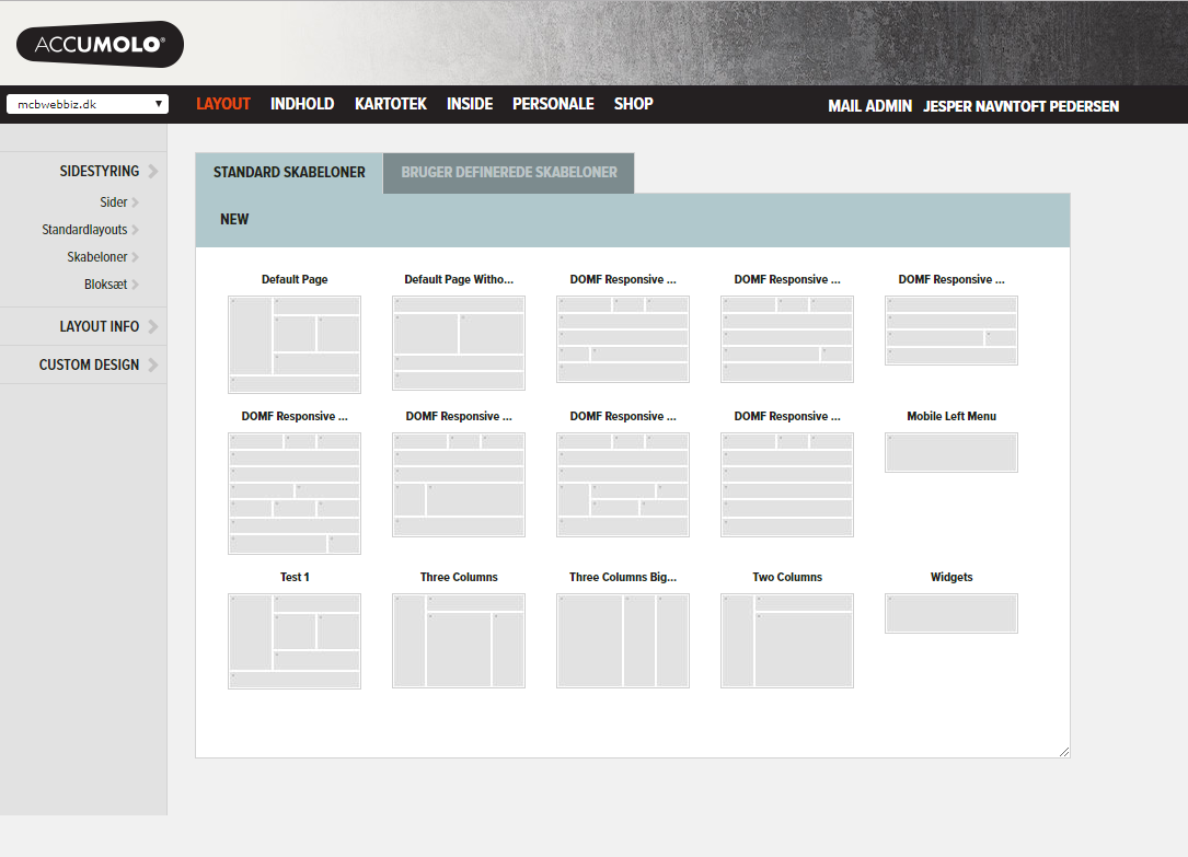
Start by picking a default template in the menu Layout>>Sidestyring>>Skabeloner
Pick the most suitable template for the page or create a new template by clicking NEW.
Modified or new template will be saved under the tab “User defined templates”.
How to modify or customize a templates grid
Controllers for modifying the template are found below the template picker. The layouts controls are meant to create the layout frame and the Customize tab has controls to adjust the template presentation on each page variant from XS to XL.
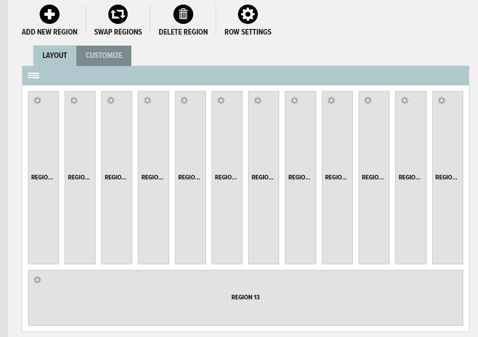
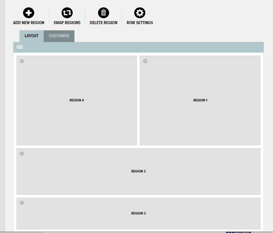
Tab Layout
- Add new region (Add a region by dragging it to the top, bottom or side of another region.
- Swap regions (Swap region placeholder - by dragging it between two content regions)
- Delete region (Delete a region)
- Row setting (Full width row settings - eg. no gutter, or CSS)
Tab Customize
- Hide (Hides the content region on the chosen page size).
- Split (Splits content regions - to a row for the chosen page size).
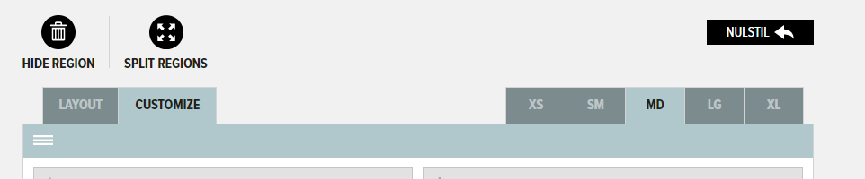
Display of tab Customize with the controls to individualize each page based on page size.
Assign layout to pages
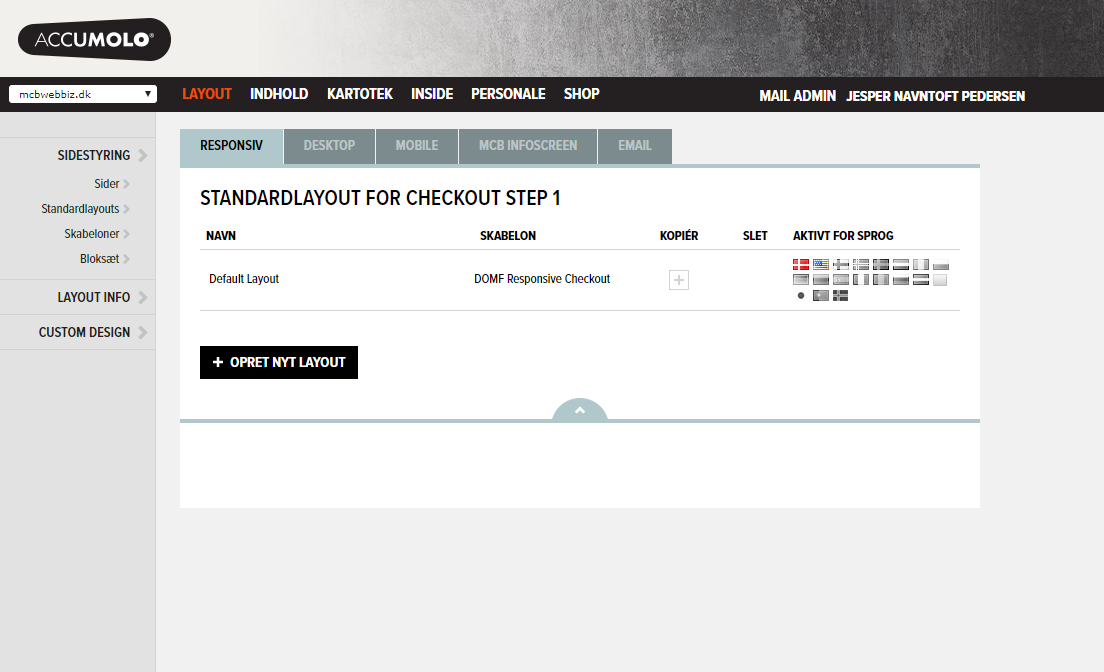
To change or apply a layout to a page - go to menu Layout>>Sider or Layout>>Standard layouts. Pick the page and click on Layout. A layout is based on a template.
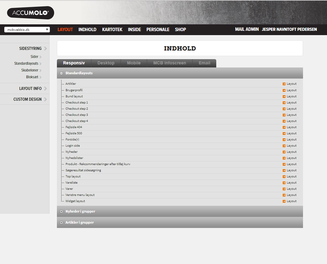
A list of all the possible layouts assigned to pages are presented with the possibility to
assign the layout to a language, copy a layout or create a new layout based on template already created.
Assignment of content blocks to layouts and regions
Below is an example of how to assign content blocks to a layout. Each content block is assigned to a content region, and settings connected to the given block is managed in the block administration.
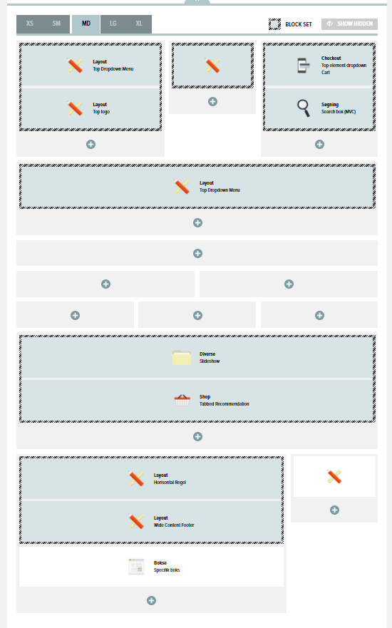
When hitting the add button on a given content region - a pop-up will be presented for the user with all the blocks possible to be added to the region.

The content block is grouped into the following groups:
- Block-sets
- Shop
- Checkout
- Account / login
- Front-pages
- Article
- News
- Layout
- Box
- Search
- Miscellaneous
Under each group you will find blocks with content and functionality to be added and configured within this interface for the block.
Block sets
A block set is a predefined set of blocks grouped together. The main use for it is to define eg. a section of a webshop, with banner, tekst and social tags. A element that needs to be presented on most or all templates. By using block sets you make it easy to insert and control the presentation of a collection of blocks in all places where it is used.